.png)

enBloom
Project Type:
Web App, Branding
UX Designers -
Scilla Nunez: UI Designer
Luisa Rincon: UX Designer
Jerniyah George: UX Designer
Montrell Mays: UX Designer
Team:
Project Brief
I helped create a site for a charity that educates users on holistic health and provides resources to get them connected to community located practitioners and service providers.
Project Outcome
The project was delivered to the client.
The Challenge
Create an online holistic health platform for the African American community in three weeks.
Black Americans find it difficult to access information and services pertaining to holistic health because of misinformation and/or unreliable sources, as well as a lack of POC representation in the form of doctors, instructors, etc. in the holistic health community.
Our Goal
-
Create a platform where users can access information as well as research and contact practitioners and service providers in their community.
-
Make booking a service with a service provider simple and straightforward.
Problem Validation & Social Impact
What is the impact of this project?
enBloom's goal is to become a source of holistic health information as well as serve as a link between service providers and the black community. This solution will allow enBloom's users access to information that is beneficial to their community and to their own well being.
Why is finding a solution to this problem important?
Social determinants of health are complicated by a lack of access to equitable health care and a lack of trust in the health care system. The medical literature shows that Black Americans are less likely to receive preventative health services, and that they experience poorer quality medical care than caucasians.[1]
In a study conducted in 2020 by Penn researchers, they found that "patient-provider race concordance led to higher odds of receiving maximum patient experience scores."[2]
Despite this, only 3.5% of holistic health practitioners are African American.[3]

Scope, Constraints,
& Elements to Consider
What are our deliverables, what are our constraints, and how do I regulate the design so that the solution is unbiased.
We had three weeks to deliver a MVP to Joi (the founder of enBloom). Since the organization was at its early stage of development she did not have any materials, data. etc. that the team could use. Creating the entire foundation for a resource and service platform was too extensive for a three week timeline so we focused on designing for the MVP that she requested during our initial consultation. We focused on 5 sections:
-
Articles
-
Book A Service
-
Donate
-
Petition
-
Volunteer
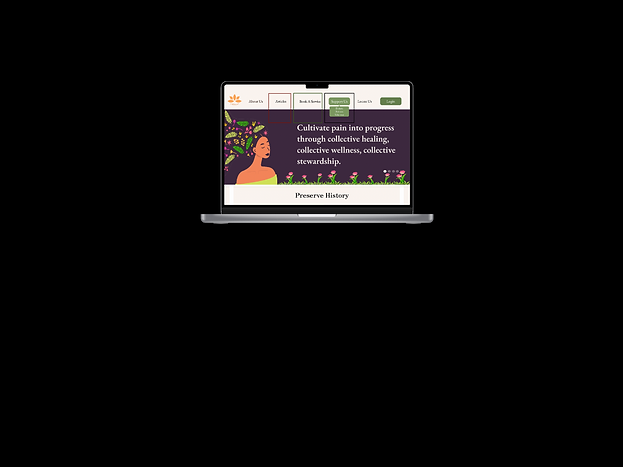
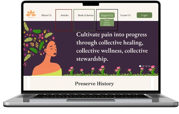_edited_edited.jpg)
The design above is the final iteration of enBlooms navigation bar. We designated a page to each section and tested each respective flow. The navigation bar's placement as well as it's order was tested as well. Click here if you'd like to skip to the usability testing process.
How did I make sure that the design is unbiased as well as accessible and well organized?
I set in place 3 design principles to create a guideline for our team so that we can stay true to the user without allowing external powers (business, client) to sway the final design.
-
Our design should provide the tools and knowledge necessary to inspire confidence in our users.
-
Interactions with our design should allow for a comfortable and memorable experience.
-
All information should be easily accessible and presented with clarity.
The team then created a research plan and moved directly to conducting interviews with prospective users.
Research & Explanation
What methods of UX research will I use to learn what the user needs and how do I employ those insights in the design?
User Interviews
I conducted in-person interviews to gain perspective from members of the community and figure out the best approach for this issue via our design.
Our users are POC from underserved communities who are interested in holistic health, but have barriers in place barring them from easy access to legitimate information as well as resources that connect them to practitioners from their shared racial group.
Usability Testing
We had 100% success with the donation and petition flows in all three rounds of usability testing. However, our users encountered issues with the "Book A Service" flow. In the first round of testing there was a 40% misclick rate that we then got down to 3% through major iterations to the design. The iterations included adding text to service photos with brief blurbs on the service as well as specific pages for each service provided. The service provider's directory was given its own page without a calendar, and we removed the map from the design because testing showed that this element was confusing our users. The team also added a drop down on the navigation bar for Services and Service Providers as well as a drop down for Support Us that included links to the donate, petition, and volunteer pages.
Below are our results for each round of usability testing.


Sketches
Click on image to view description


The Solution
Create a website that educates users on holistic health and provides resources to get them connected to community located practitioners and service providers.
Reflection & Next Steps
Creating a solution for the community who needs holistic information, but lacks the resources to find a trusted source.
Reflection
I had the chance to practice empathetic thinking while conducting research and working on the design of this project. This was my first time developing a solution without any data, materials or actual users, so it was very gratifying to see its outcome. It was an enjoyable experience that gave me a new perspective on how information and resources should be presented so that it is accessible to the user.
Design is an iterative process. There is no end point.
Next Steps
I would be interested in continuing our testing, specifically on the carousel that is located on our home page. The current design's carousel has enBloom's mission statement coming up as the first image followed by a call to action to donate and the site's other services. I would like to know if the current order of these images serves our users the best, or if rearranging them would result in a greater impact. When the website goes live, I would like to check the carousel's conversion rates to see if there is a drop off after the first slide.
Citations
1. Gray DM 2nd, Anyane-Yeboa A, Balzora S, Issaka RB, May FP. COVID-19 and the other pandemic: populations made vulnerable by systemic inequity. Nat Rev Gastroenterol Hepatol. Published online June 15, 2020. doi:10.1038/s41575-020-0330-8
2. Takeshita J, Wang S, Loren AW, et al. Association of Racial/Ethnic and Gender Concordance Between Patients and Physicians With Patient Experience Ratings. JAMA Netw Open. 2020;3(11):e2024583. doi:10.1001/jamanetworkopen.2020.24583Takeshita J, Wang S, Loren AW, et al. Association of Racial/Ethnic and Gender Concordance Between Patients and Physicians With Patient Experience Ratings. JAMA Netw Open. 2020;3(11):e2024583. doi:10.1001/jamanetworkopen.2020.24583
3. Castillo-Page L. Diversity in medical education: facts and figures 2019. Washington, DC: American Association of Medical Colleges, 2019.